GRAPHICS 9
THE COLOUR WHEEL
We need a practical and logical system to organize colours, which is why the colour wheel was developed. Being able to understand the terms and processes that go along with color will help you knowledgeably communicate your vision when it comes to your art and designs.
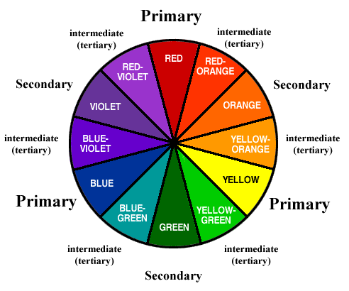
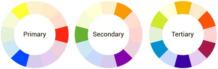
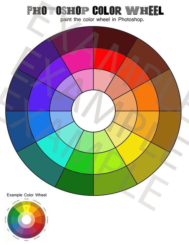
The colour wheel is made up of 12 colours: 3 primary, 3 secondary, and 6 tertiary
The colour wheel is made up of 12 colours: 3 primary, 3 secondary, and 6 tertiary
https://99designs.ca/blog/tips/the-7-step-guide-to-understanding-color-theory/
|
https://www.colormatters.com/color-and-design/basic-color-theory
|
Primary Colours: Red, yellow and blue
In traditional color theory (used in paint and pigments), primary colors are the 3 pigment colors that cannot be mixed or formed by any combination of other colors. All other colours are made from these 3 hues.
Secondary Colours: Green, orange and purple
These are the colors formed by mixing the primary colors.
Tertiary Colours: Yellow-orange, red-orange, red-purple, blue-purple, blue-green & yellow-green
These are the colors formed by mixing a primary and a secondary color. That's why the hue is a two word name, such as blue-green, red-violet, and yellow-orange.
(https://www.colormatters.com/color-and-design/basic-color-theory)
Warm and Cool
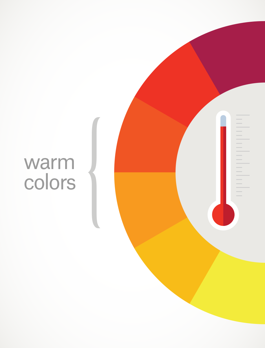
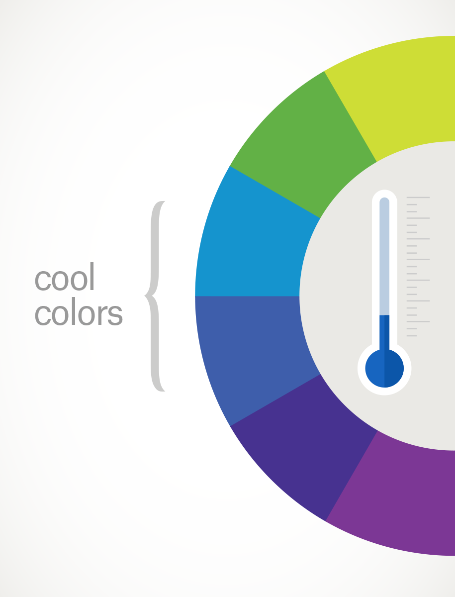
Warm colours are generally associated with energy, brightness, and action, whereas cool colours are often identified with calm, peace, and serenity.
When you recognize that colour has a temperature, you can understand how choosing all warm or all cool colours in a design can impact your message.
When you recognize that colour has a temperature, you can understand how choosing all warm or all cool colours in a design can impact your message.
(https://99designs.ca/blog/tips/the-7-step-guide-to-understanding-color-theory/)
Infinite choices: Colour Mixing and TINTS/SHADES

How do we get more than the 12 colours on the colour wheel? By mixing colours, which can create an infinite amount of colours. As well as by creating tints and shades, which also generates an infinite amount of combinations.
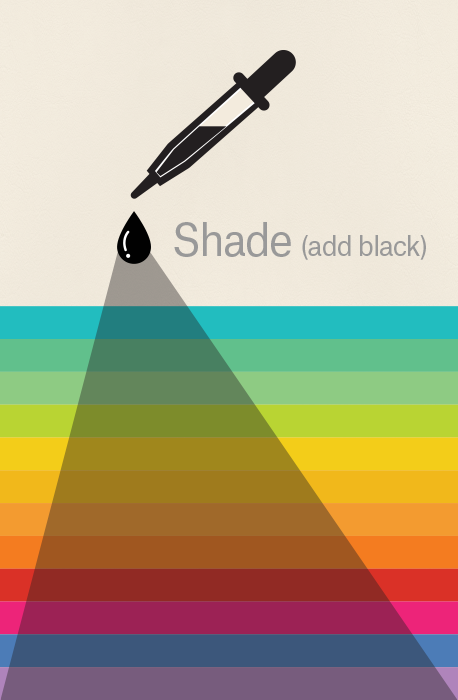
Simply put, tints and shades are variations of hues, or colours, on the colour wheel. A tint is a hue to which white has been added. For example, red + white = pink. A shade is a hue to which black has been added. For example, red + black = burgundy.
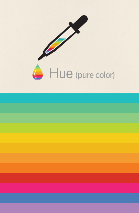
HUE = A COLOUR
TINTS = ADD WHITE
SHADES = ADD BLACK
Simply put, tints and shades are variations of hues, or colours, on the colour wheel. A tint is a hue to which white has been added. For example, red + white = pink. A shade is a hue to which black has been added. For example, red + black = burgundy.
HUE = A COLOUR
TINTS = ADD WHITE
SHADES = ADD BLACK
(https://99designs.ca/blog/tips/the-7-step-guide-to-understanding-color-theory/)
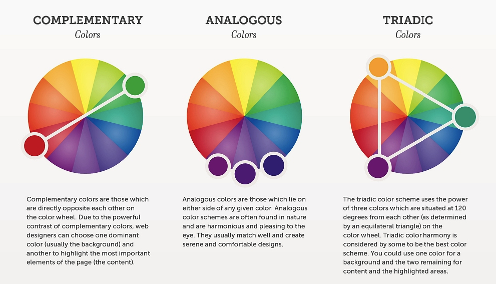
Colour Schemes: Creating Harmony
Putting certain colours together are visually pleasing to the eye. They can make your designs that much more powerful.
https://www.crazyegg.com/blog/website-color-palettes/
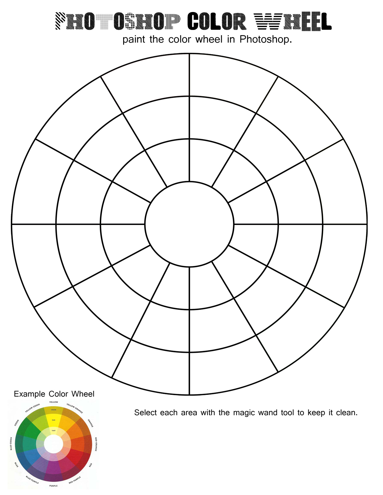
PART 1: Download the following file and open in Photoshop:
| photoshopcolorwheeltemplate1.jpg |
Use Photoshop to "colour" all of the parts of the colour wheel. Hand in the JPG version ONLY with your NAME.
PART 2: DESIGN IN CONTEXT - LOGO SEARCH
Find 2 examples of LOGOS or ADVERTISEMENTS that fit into the following categories:
You should have a total of 20 LOGOS/ADS examples. Put them all into 1 WORD doc or JPG image. Hand in with your NAME.
- warm colours
- cool colours
- complimentary colours
- analogous colours
- triadic colours
- primary colours
- secondary colours
- tertiary colours
- a colour scheme that you think works well
- a colour scheme that you don't think works well
You should have a total of 20 LOGOS/ADS examples. Put them all into 1 WORD doc or JPG image. Hand in with your NAME.
