Graphics 9: Swatch it UP! DUE APRIL 17
READ: Why the right colour palette matters for your brand
What about colour? With colours you can set a mood, attract attention, or make a statement. You can use colour to energize, or to cool down. By selecting the right colour scheme, you can create an ambiance of elegance, warmth or tranquility, or you can convey an image of playful youthfulness. Colour can be your most powerful design element if you learn to use it effectively. For artists and designers, however, the application of colour is a deeply considered, deliberate choice, not simply an intuitive one. By better understanding how colour is formed and the relationships between different colours, the colour decisions in any piece of art or design becomes much more intentional and effective.
PART 1:
How would you define your own colour choices, and the choices of your peers?
How would you define your own colour choices, and the choices of your peers?
- Pair up with a partner and analyze the palette you have created for yourselves by way of your choice of clothes for the day.
- With a sketchbook, markers, and/or coloured pencils, build a five-swatch palette based on the colours you’re wearing, and a five swatch palette based on the colour of your partner’s clothes.
- Make brief notes on the palettes you have created. Are they predominantly warm or cool? Do they rely on analogous or complementary colors? Are there tints or shades of a dominant color? Are the colors bright and highly saturated or more dull and unsaturated? Could the two palettes be combined, or do they seem too different? What do the colors alone seem to say about each each other’s mood or personality?
PART 2:
Now Swatch it UP!
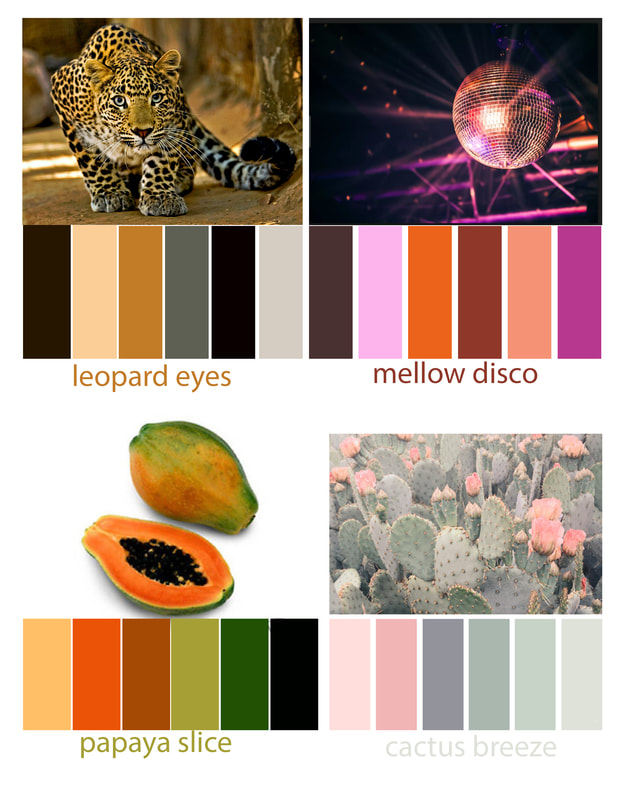
(create 4 different colour swatch photographs similar to the examples above HOWEVER, take some creative license, instead of rectangles, do circles - it is up to you! Look online -PINTEREST is amazing- for some cool colour swatch inspiration!)
Now Swatch it UP!
(create 4 different colour swatch photographs similar to the examples above HOWEVER, take some creative license, instead of rectangles, do circles - it is up to you! Look online -PINTEREST is amazing- for some cool colour swatch inspiration!)
- Open a new document in Photoshop, 11x8.5 for horizontal and 8.5x11 for vertical - Fit all 4 swatches onto it and be sure to leave a WHITE BORDER all around (check example above)
- File-->Place Embedded --> Choose the photograph that you were working from to create the colour swatch
- Shape tool --> Colour Fill --> Choose one of your new colours to fill the shape
- Repeat step 3 until you have created 6 shapes with your new swatch
- Save your PSD file
- Save as JPG
- Hand in both your images as: yourname_swatches
Part 1 adapted from: https://www.aiga.org/graphic-design-training-curriculum-for-high-school-teacher / Part 2 and photos adapted from: https://scrapgirls.com/tutorial-index/create-color-swatches-photos


